Meaningful Excel charts
Inserting a simple chart into an Excel file is not a problem. Unfortunately, charts are mostly left in the standard design of Excel. This is not a problem in general, but it means that the recipient cannot see at first glance what the main message of the chart should be. Fortunately, you can get a lot more out of most charts with a few simple tricks.
Below we have created some charts to show a couple of options – the possibilities are almost endless. The flexibility of the individual charts can be tested in the corresponding Excel file.
We are happy to receive feedback on this. We are also happy to incorporate wishes or to find a solution for specific questions.
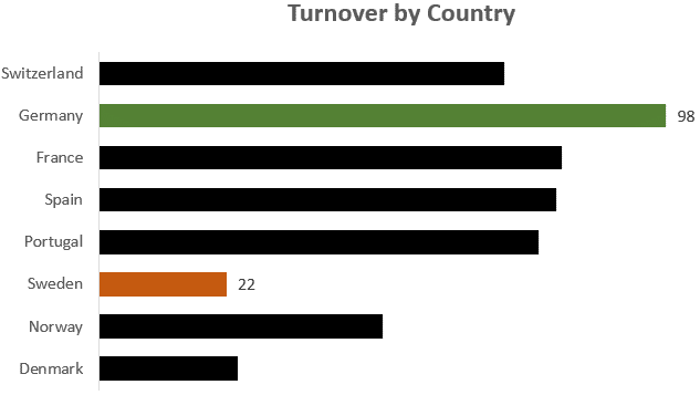
The countries with the highest / lowest sales are highlighted in color and the values are displayed.
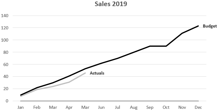
The legend is not above or next to the chart but exactly next to the corresponding line so that at first glance you can see what each refers to.
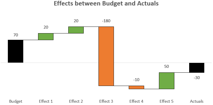
This waterfall chart is completely dynamic and also works without problems if the values go below zero. There are also connecting lines between the individual bars to further increase readability.
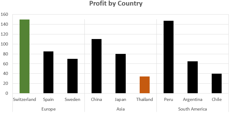
Color highlighting of the largest and smallest value as well as vertical dividing lines.
The upper chart shows actual data and the lower chart shows the deviation from the budget. An alternative to this chart would be to additionally display the bars for budget.

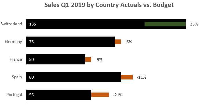
Simple and clear deviation between actual and budget.

This chart is automatically sorted according to the size of the values.

Simple and clear comparison between actual and budget.

In this chart actual is compared with budget. A green bar is a positive and a red bar a negative deviation.
Here we compare actual and forecast and there is also a subdivision into benchmark levels.
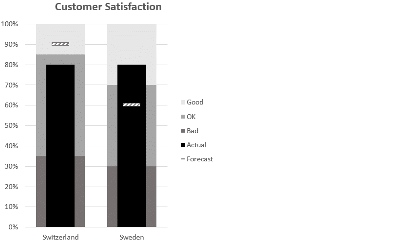
Maximum and minimum values are automatically marked in color and there is a gray bar which shows the range in which the comparison values were. In addition, the legend is automatically shown at the correct location.

Here 3 categories are shown in a line diagram. There are actual figures for the first few months, followed by the forecast until the end of the year and then the budget for the following year.
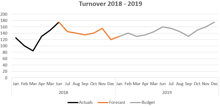
In this diagram the legend is linked in such a way that it is always displayed in the correct place.

The bars show absolute values, but at the same time it also shows how high the percentage of each bar is in the whole.

Several diagrams in one, whereby the scaling is identical and the charts can thus be compared with each other.
sale per country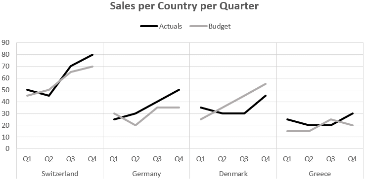
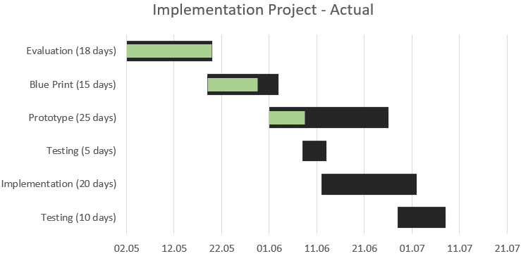
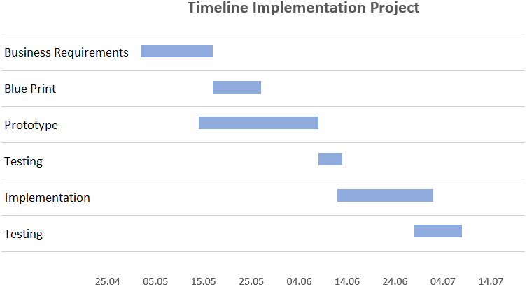
Simple chart to show a project plan.
A project plan including progress per task.